Sometimes there’s data. You’ve got a bunch of it, you need to work out how to represent it in a way that not only makes sense to you, but is also appealing in some fashion. I’m going to talk about a couple of different use cases in this post, each with their own unique data presentations. First, the sensors.
I’ve got a couple of SwitchBot Meter Plus sensors around the house. One is in my office, and the other is in the garage. There isn’t much to them, small little things, battery powered. Pretty much it’s a little monochromatic LCD screen with a temp/humidity sensor and a bluetooth radio. That won’t do, on its own, of course. So, I added SwitchBot’s Hub Mini to the party. It’s a little bridge device that plugs into the house’s AC mains, and has both BT and WiFi radios inside. While I haven’t cracked it open, the device shows up with a MAC address that suggests it’s little more than an ESP32 or ESP8266 microcontroller inside. With the hub in place, connecting the sensors to the SwitchBot cloud, a really important thing happens – the sensors become accessible via SwitchBot’s REST API. So, I’m using some custom-written Python code that runs under Docker to read the sensors. Turns out it was all surprisingly easy to put the pieces together. It was also a pre-cursor to another project I went on to do, where I helped a friend using a similar sensor to control a smart plug to operate a space heater.
So, what does one do with a sensor like this? You read it, naturally. You keep reading it. Over and over at some sort of fixed interval. In my case, I’m reading it every 5 minutes, or 300 seconds, and storing the data in a database. This type of data isn’t particularly well-suited to living in a SQL database like MariaDB, Postgres, etc. This is a job for a time-series database. So, I called on InfluxDB here. It’s relatively small, lightweight, and very well understood. The Python modules for it are pretty mature and easy to work with even, so it was easy to implement as well. Total win. So, read sensor (convert C to F, since I’m a Fahrenheit kind of guy), store in database, sleep(300), do it again. Lather, rinse, repeat. Just keep on doing that for roughly the next, forever. Or until you run out of space or crash. That’s the code right there, in a nutshell.

So, what are we visualizing? At the right, you can actually see what I’m graphing. The InfluxData team were nice enough to include some visualization tools right there in the box with InfluxDB, so I’m happy to take advantage of them. Many folks would prefer to use something a bit more flashy and customizable like Grafana, and that’s totally cool. I’ve done it too, even with this same dataset, and the data looks just as good. Heck, probably even looks better, but for me, it was just one more container to have to maintain with little extra value returned. The visualization tools baked into InfluxDB are good enough for what I’m after.
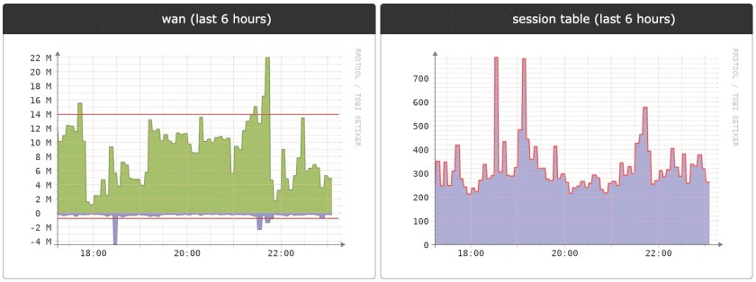
Next up? Keeping an eye on what’s up with my WAN router’s Internet-facing link. Here at the homestead, I’m running LibreNMS to keep an eye on things. Nothing nearly as custom here. It’s more off the shelf stuff here. It all runs (again) in Docker containers, and as you’d likely expect, uses SNMP to do the bulk of its monitoring duties. at the right, you can see some sample graphs I’ve got stuck to the dashboard page that give a last 6-hours view of the WAN-facing interface of my Internet router, a Juniper SRX300. You see the traffic report as well as the session table size. Within LibreNMS, I’ve got all sorts of data represented, even graphs of how much toner is left in the printer and the temperature of the forwarding ASIC in the switch upstairs in the TV cabinet. All have their own representations, each unique to the characteristics of the data.
Bottom line? Any time you’re dealing with data visualization, there is no one-size-fits-all. Spend the time with the data to figure out what makes the most sense for you and then make it so!

You must be logged in to post a comment.